- Industry: Compensation
- Problem: My client needed an online tool to allow her company and clients a way to compare compensation across different companies in order to make more efficient compensation decisions
- Role: UX designer
- Performed research
- Created wireframe solutions
- Outcome: A secure, online tool that provided tailored and actionable insights into compensation decisions
When designing visual displays of information it’s important to understand how to effectively convey it in a way that the viewer gains clarity and actionable insight from what they’re seeing. Whether it’s comparing prices, analyzing data sets, or evaluating performance metrics, the design of numeric comparisons plays a pivotal role in ensuring a positive user experience. In this post, I’ll talk about the key considerations that UX designers should take into account when creating interfaces for comparing numeric values.
Clarity of presentation –
The first consideration in designing numeric value comparisons is clarity. Users should be able to quickly understand and interpret the data presented. Think about using clear labels, concise descriptions, and visual elements such as charts or graphs to enhance comprehension. Avoid clutter and focus on delivering information in a format that is easy to digest. The image below shows two charts that represent the same data. My chart is on the top and another chart is on the bottom. Our research uncovered that a user needs to see the difference between certain elements of data. In this case let’s say it’s the difference between annual bonuses. The stacked bar chart below attempts to do this but is unsuccessful because there is no base line for comparison. Even though the color coding and labeling shows the differences, the user has to spend more cognitive effort understanding these changes. By creating a normal bar chart, but with each component on its own baseline, it’s much easier to quickly grasp the differences.

Scale and units –
Always be mindful of the scale and units used in numeric comparisons. Ensure consistency and make it easy for users to grasp the magnitude of the values. Choosing appropriate units and scaling options helps users compare values more effectively. Interactive features like toggling between different scales can further enhance the user’s ability to understand the data.
Color and contrast –
Use color and contrast strategically to highlight important information. Use distinct colors for positive and negative values or to emphasize particular data points. But, don’t rely solely on color, as some users may have color vision deficiencies. Always provide alternative methods, such as labels or patterns, to convey information.
Interactivity and user controls –
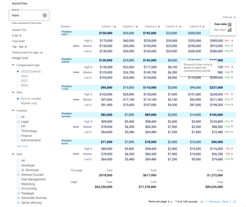
Offering users the ability to interact with the data creates a more engaging experience. Implement features like zoom, pan, and filtering options that allow users to focus on specific data points or time frames. Providing user control enhances the flexibility of the interface, accommodating a range of user preferences and requirements. The image below highlights the filtering options a user has available to be able to see the data in different ways to get to the information they need. You can also see in the upper right that I’m giving the user the user the ability to see these same numeric values visually in a chart. By giving your users the ability to see the same data in different ways you allow them the ability to gain certain insights they might not have seen with other layouts.
Accessibility –
Accessibility is a fundamental aspect of UX design. Ensure that your numeric value comparisons are accessible to users with disabilities. This includes providing alternative text for visual elements, using semantic HTML, and adhering to accessibility standards. Users who rely on screen readers or other assistive technologies should be able to comprehend the information seamlessly.
Consistent design language –
Use a consistent design language throughout your interface. Consistency in the presentation of numeric values helps users develop a mental model, making it easier for them to navigate and understand the information. Consistent use of typography, colors, and layout contributes to a cohesive and user-friendly experience.
Responsive design –
Given the diverse range of devices users may interact with, it’s essential to ensure that your numeric value comparisons are responsive. The interface should adapt gracefully to different screen sizes and resolutions, maintaining readability and usability across various devices. But be aware, it can be a challenge to show data like this on smaller screens. You’ll need to spend time determining what works best.
Performance optimization –
Efficiently handling and presenting numeric data is crucial for a smooth user experience. Optimize the performance of your interface, especially when dealing with large datasets. Consider implementing features like lazy loading to enhance loading times and overall responsiveness. Performance is one of the key consideration when determining if an interface is successful or not. This is another great example of how important it is that you create strong relationships with your developers. UX is holistic. It takes a team to get things into production successfully.
Designing effective ways to compare numeric values requires a thoughtful and user-centric approach. By prioritizing clarity, scale, color, interactivity, accessibility, consistency, responsiveness, and performance, designers can create interfaces that empower users to make informed decisions and glean insights from the data. The goal is to drive actionable understanding and insight so your users can make the right decisions.