- Industry: Airline
- Problem: A inefficient system needed to be streamlined
- Role: UX researcher/designer
- Research
- Process flows
- Wireframes
- Outcome: A much more efficient process and better user experience
As a UX designer, I’ve had the opportunity to work on a wide range of projects, each with its own set of challenges and learning experiences. One of the most enjoyable projects I’ve worked on was the redesign of the Delta Cargo check-in process. With its extensive global network and a fleet of over 800 aircraft, Delta Cargo transports nearly half a million tons of cargo around the world every year. As a leader, Delta recognized the need to improve their cargo check-in process to enhance efficiency, reduce errors, and improve overall user satisfaction.
Understanding the Problem: Research and Discovery
Delta said their goal was to streamline and improve their cargo check-in process. Before diving into any design work, we first had to understand the current system and its capabilities. The first step in any design process is research.
Our research began with a comprehensive understanding of how the process currently worked. We conducted interviews with both stakeholders and the end users of the system—everyone from operational managers to cargo agents. We also reviewed any existing documentation to understand more detail. Important insight came from on-site observations. There’s nothing like watching people do things. You learn so much.
Identifying Key Pain Points and Opportunities
Through our research, several key issues became apparent:
- Redundant Screens: Many screens in the current workflow were obsolete. This not only added time to the check-in process but also created confusion among users who were instructed to “just ignore” certain screens.
- Inefficient Form Design: The form fields were cluttered and lacked clear labeling, leading to frequent errors and a reliance on outdated documentation.
- Poor Integration: The existing system wasn’t well-integrated with other backend systems, resulting in repetitive data entry and reduced efficiency.
- Lack of Accessibility: The design did not consider accessibility needs, which is critical for creating an inclusive user experience.
Armed with these insights, we set Key Performance Indicators (KPIs) to measure the success of our redesign. These included reducing the average time to check in cargo, minimizing errors, and decreasing reliance on external documentation.
Designing the Solution: From Concept to Prototype
With a clear understanding of the current process and pain points, we began sketching out ideas for improvement. Our design goals were:
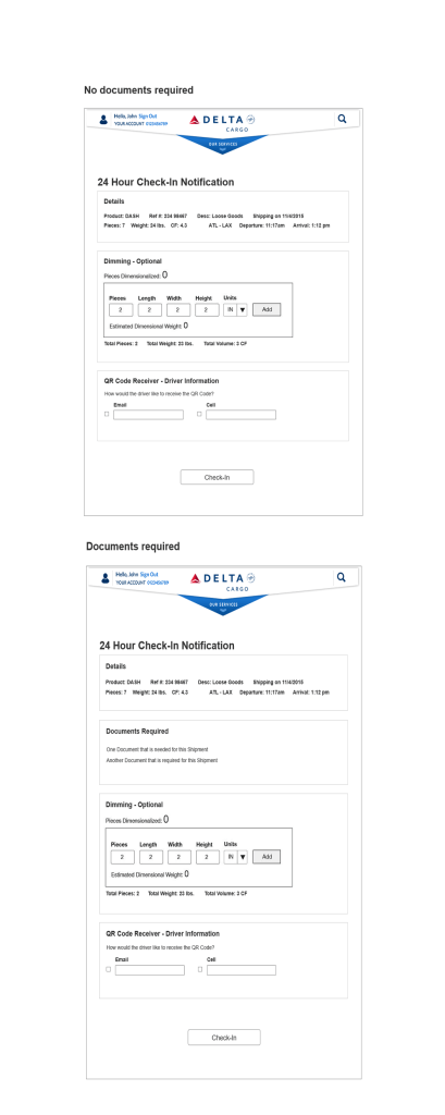
- Streamline the Workflow: Reduce the number of screens and steps in the process to minimize cognitive load and improve efficiency.
- Enhance Form Usability: Simplify form fields, provide clear labels, and use smart defaults to minimize errors.
- Improve System Feedback: Clearly communicate system status and provide effective error messages.
- Optimize for Mobile: Ensure the process was optimized for mobile devices, reflecting the on-the-go nature of cargo handling.
- Integrate Accessibility: Build accessibility considerations into the design from the ground up.
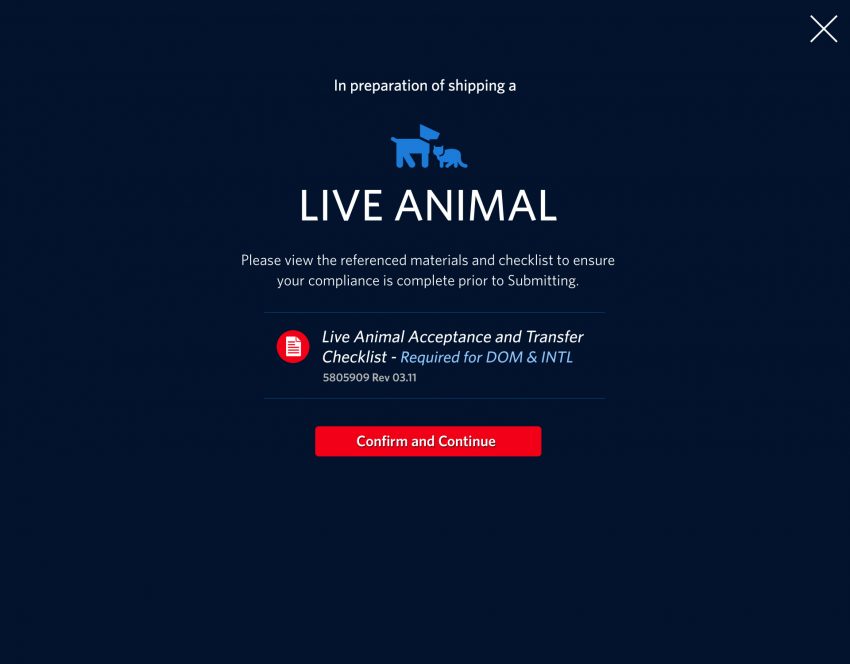
The redesigned flow broke down the process into six distinct steps, each clearly labeled and easy to navigate. We introduced clear calls to action and a consistent visual hierarchy to guide users through the process seamlessly. Tooltips were strategically placed to provide guidance without overwhelming users, and form fields were streamlined to reduce the need for excessive typing. Importantly, we also built in accessibility features to ensure that all users, regardless of ability, could interact with the system efficiently.

Measuring Success: Quantitative and Qualitative Outcomes
The results of our redesign were impressive:
- Reduced Check-In Time: The average time to check in cargo dropped 23% in one month.
- Decreased Reliance on Documentation: With the introduction of contextual tooltips and a more intuitive design, users no longer needed to rely on fragmented and outdated documentation for answers.
- Improved Cognitive Clarity: By simplifying language and refining labels, we reduced confusion and made the system more intuitive.
- Increased Efficiency: Planned integration of backend systems would eliminate redundant data entry, further streamlining the process.

Conclusion: A User-Centered Approach Yields Tangible Results
This project underscored the power of a user-centered approach to design. By focusing on real user needs and pain points, we were able to deliver a solution that not only improved the efficiency of Delta’s cargo check-in process but also improved worker satisfaction. Delta recognized the value of a UX-driven redesign, and our collaboration proved that even small changes, when guided by thoughtful design principles, can have a big impact.
In UX, our goal is always to solve problems by putting people at the center of our design decisions. The success of this project serves as a testament to the value of this approach, proving that when we prioritize user needs, the outcomes are beneficial for both the users and the business. A truly holistic approach.


